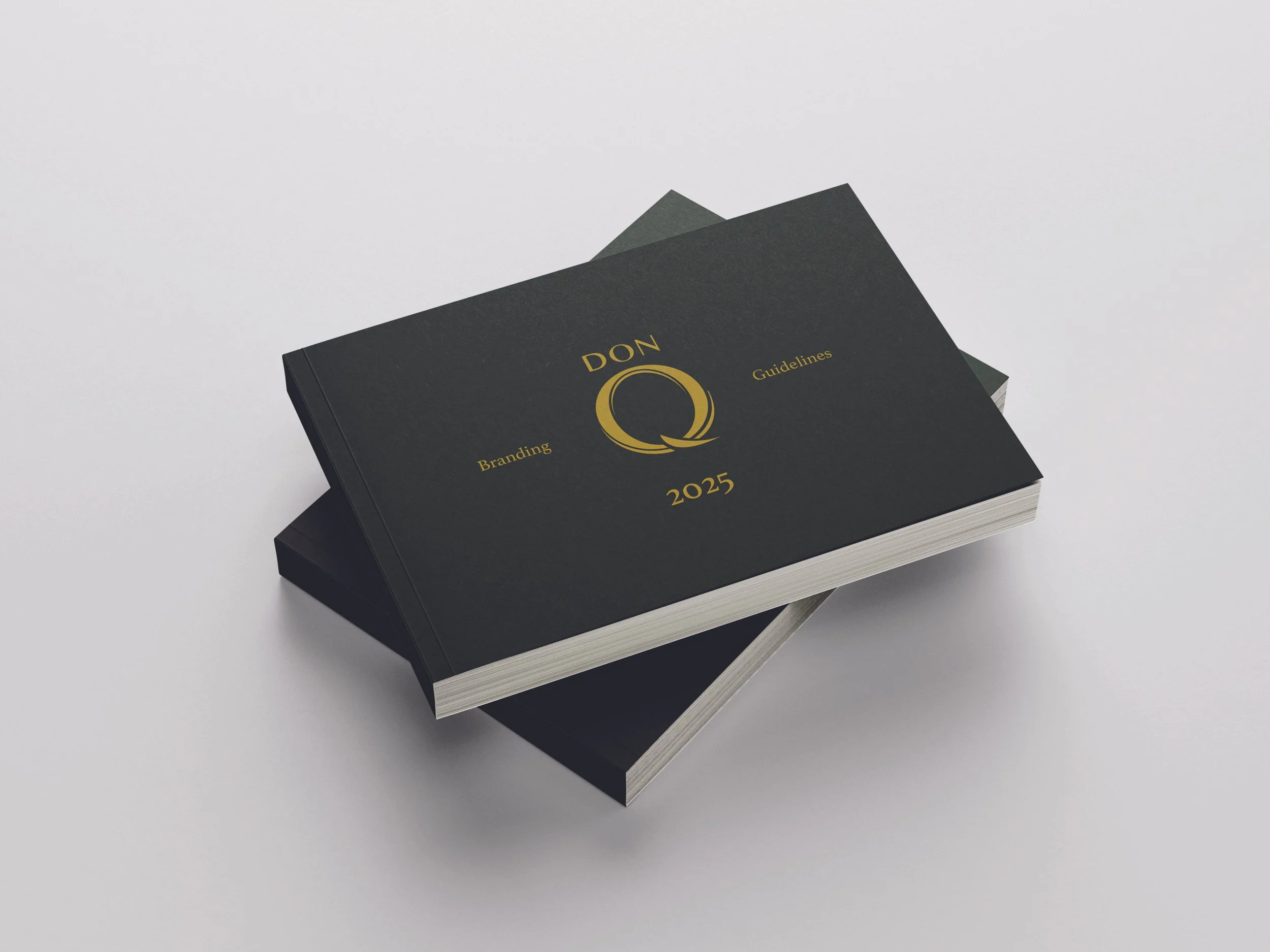
Don Q Rebrand
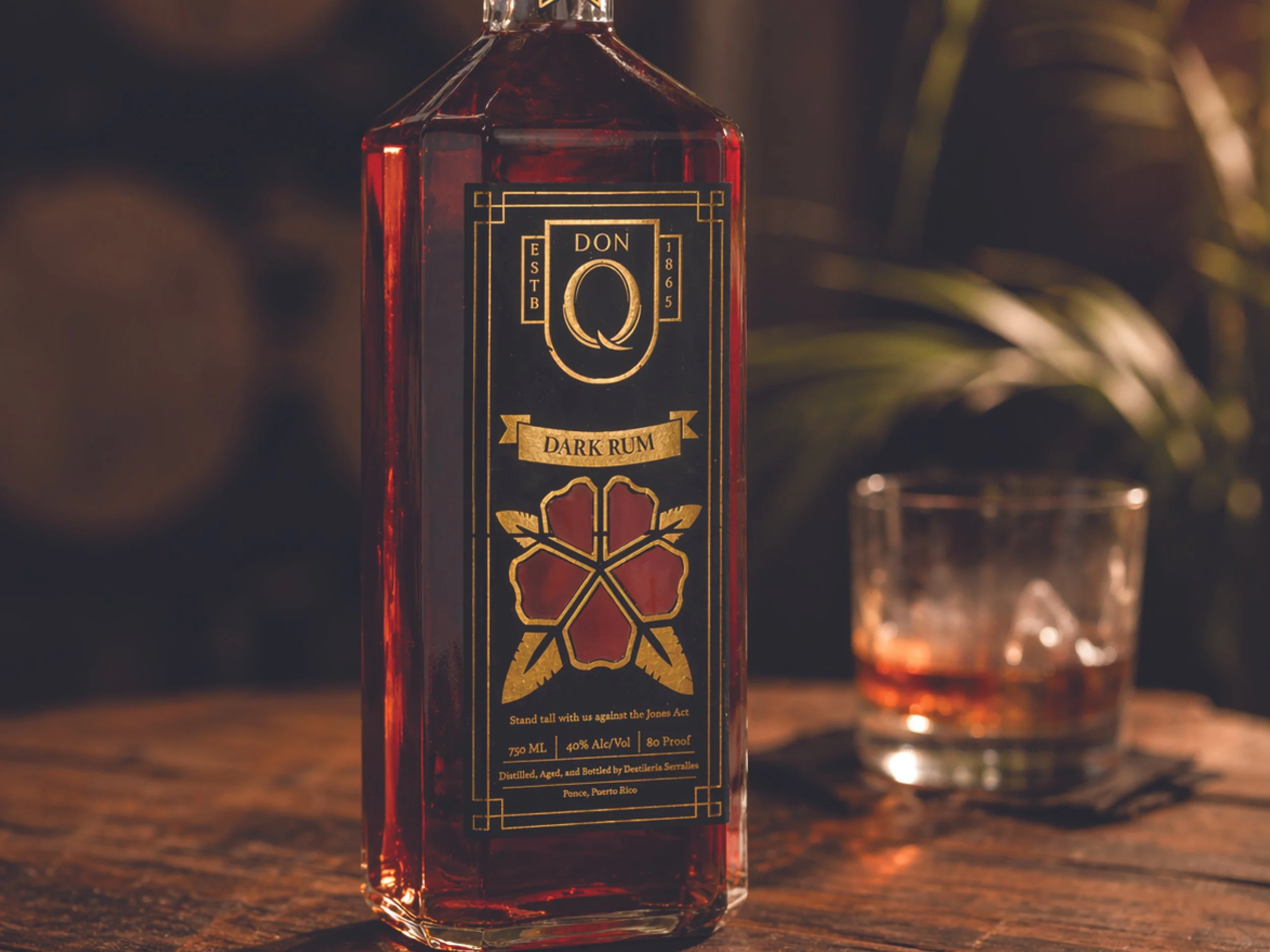
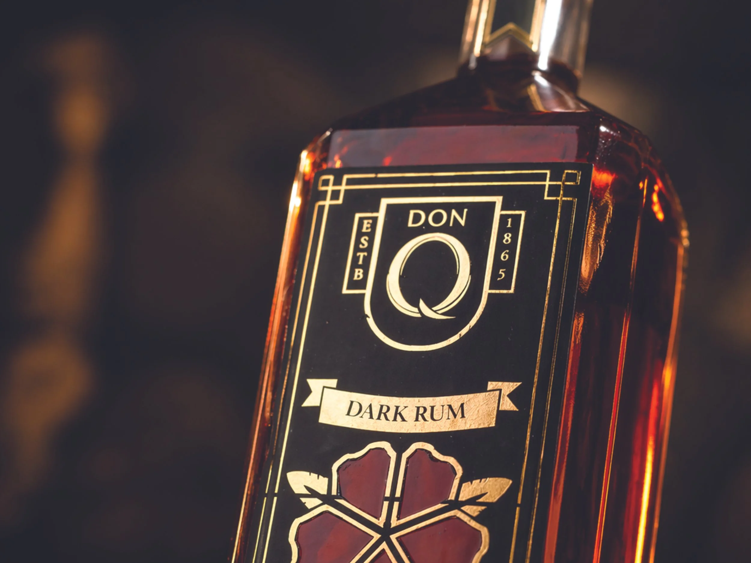
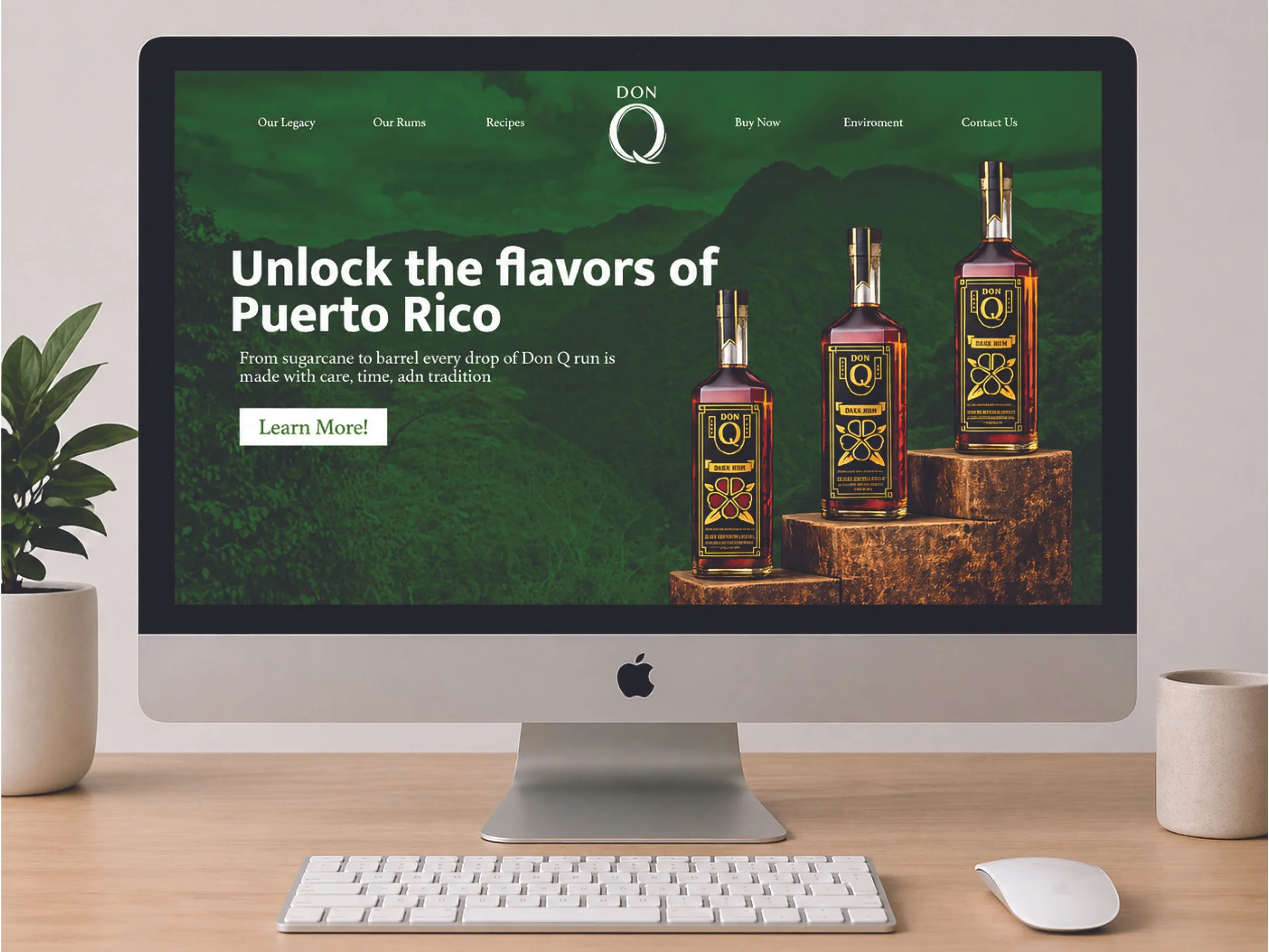
This Don Q bottle redesign is built around the concept “Nature Outnumbers the Spirits,” using the packaging as a reflection on the impact of the Jones Act in Puerto Rico. I created an Art Deco–inspired label system with gold detailing and structured linework, paired with a central floral emblem symbolizing resilience and what remains as people leave the island. The design extends across both sides of the bottle, with messaging like “Stand Tall” reinforcing themes of endurance, while the contrast between the dark label and amber rum creates a refined, atmospheric presence.